
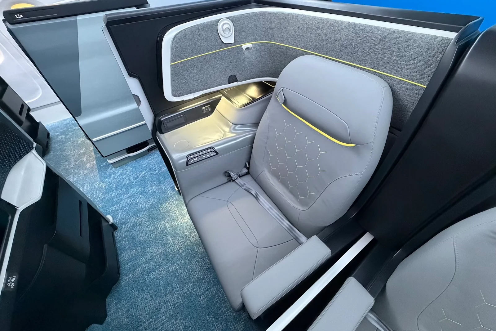

When Singapore Airlines finally unveiled its new long-haul First and Business Class at Marina Bay Sands on Friday, we suggested the Business Class colour scheme was likely to divide opinion. Well, that turned out to be something of an understatement.
The dust has started to settle a little, and the verdict from frequent flyers and much of the aviation media is in. It isn’t kind. In fact, the comments on our launch article could almost have written an opinion piece themselves, so we thought heck – here it is.
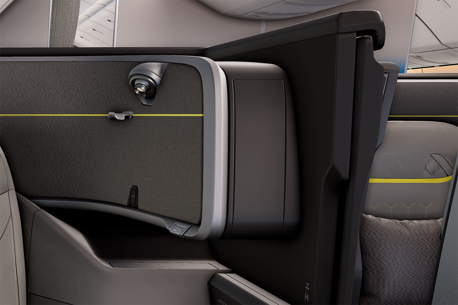
To be clear, this isn’t about the airline’s new First Class, which has been broadly well received. It’s the new Business Class, or “2027 J”, and specifically its mineral grey and bright yellow look, that has everyone talking.
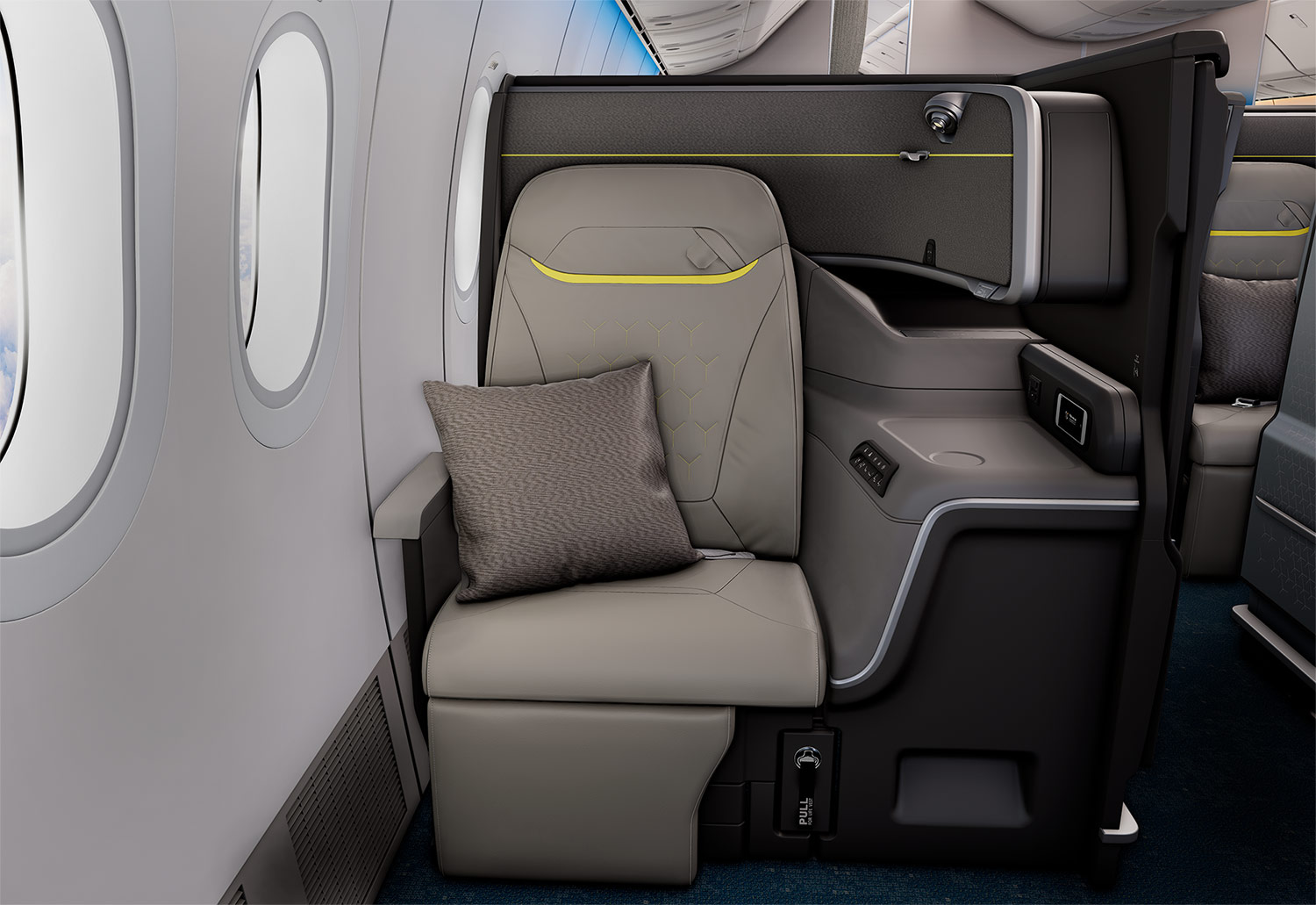
(Image: Singapore Airlines)
What the media is saying
Some of the best-known names in aviation and travel media didn’t mince their words on this one.
Head for Points editor Rhys Jones called the new seat such a radical departure in style that it’s “virtually unrecognisable as a Singapore Airlines seat”. He struggled to see how its automotive styling fits with the rest of the SIA experience, from the refurbished lounges and colourful crew uniforms to the airline’s signature batik, and likened its technical, synthetic feel to a gaming chair.
“It’s a perplexing choice… the First Class and Business Class seats feel like they were designed for totally different airlines.”
Rhys Jones, Aviation Editor, Head for Points
One Mile at a Time founder Ben Schlappig went a step further.
“It looks like Scoot and Spirit Airlines had a baby.”
Ben Schlappig, Founder, One Mile at a Time
Like many others, he was also struck by how much the First and Business Class finishes are mismatched, to the point that you wouldn’t assume they belonged to the same airline.
Aviation journalist Edward Russell summed up the look as “a real miss” with strong low-cost carrier vibes on X, while PYOK founder Mateusz Maszczynski was blunter still, saying “I haven’t seen an uglier new Business Class seat in quite some time.”
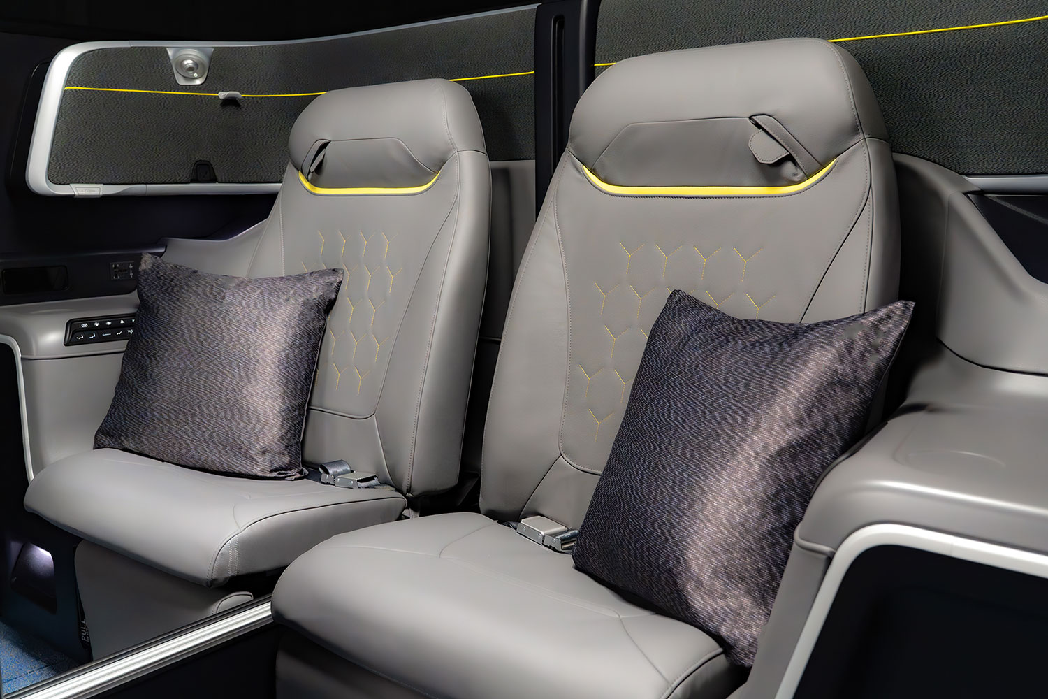
(Photo: Singapore Airlines)
We weren’t immune to the low-cost carrier comparison either. In our launch coverage, we noted that grey with flashes of yellow is more reminiscent of SIA’s low-cost subsidiary Scoot than of the airline’s own premium cabins.

(Photo: MainlyMiles)
Frequent flyers aren’t impressed either
Our own readers didn’t hold back in the comments on our launch article, with the vast majority focused on the Business Class colours.
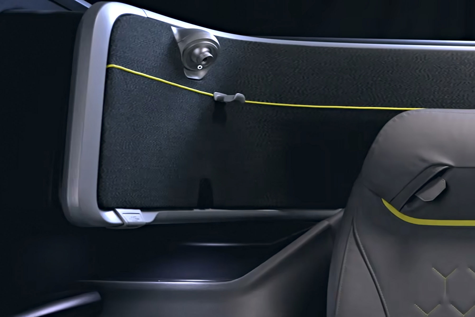
(Image: Singapore Airlines)
Plenty made the same comparison straight away. Jack said it felt like Scoot or a budget airline, Mick welcomed everyone aboard “Scoot plus plus”, and Callum‘s first thought was actually Ryanair, adding that scratches would show up “like a treat” on the hard plastics.
Roland predicted passengers and social media would be calling it “Scoot biz in SQ metal”, at least until people can see the seats for real.
Notmamouchi summed up the frustration in one line. “You’re telling me they had 10 years, interviewed 5,000 people and came up with a seat width reduction of 21%? Is there a word in Singlish for that??”
We can think of a few, but we’ll keep the article family-friendly!
Others focused on the palette itself. Josephine, a frequent SQ Business Class flyer, found the light grey cold and lacking the premium feel she expects from Singapore Airlines, while Eugene found the effect clinical, saying it “feels like a boardroom in the sky.”
Vine offered a constructive alternative. If the goal was a high-tech look, darker charcoal or black tones would have felt “much more premium, sophisticated, and futuristic than light grey”. Nasir would have preferred something closer to the purple-accented Business Class seats on the carrier’s A380.

(Photo: MainlyMiles)
Mike went beyond colours, arguing that a premium airline needs a consistent design philosophy across every touchpoint, saying “Cathay gets this”. He also pointed to the growing gaps between aircraft types, with refitted A350s getting OLED screens and fast-charging USB-C while the brand new 777-9s get smaller screens and older tech.
His verdict was that SIA is “creating an aircraft lottery”, and it’s hard to argue against that given these mismatches, even within a future 2027 J fleet.
Stephen asked what actually ties the cabin architecture together as a design language from nose to tail (we think it’s safe to say – nothing!).
It wasn’t entirely negative, though. Bob actually preferred the new Business Class to the new First Class, which he found disappointing “after all the hype”.
Over on FlyerTalk, it took less than an hour for the first Scoot comparison to appear, and there have been plenty more since. Others likened the seat to something from Lufthansa, ZIPAIR, a “mid-tier European airline”, a racing car and even a dentist’s chair.
A recurring theme is the lack of cohesion between cabins.
One long-time Singapore-based SIA flyer pointed to an “utter lack of cohesion” across First, Business and the new 777-9 Premium Economy and Economy cabins, which look like they were designed by different teams.
Essentially, that’s because they were. PriestmanGoode were responsible for First Class, Designworks for Business Class, and Factorydesign for Premium Economy and Economy.
Some raised practical concerns too. Light grey finishes may show marks and scuffs quickly, and several posters thought the moulded console surfaces looked plasticky. A few assumed the upholstery is leatherette, chosen to be easy to clean, though SIA’s specifications confirm it is full-grain premium leather, with bespoke embroidery.
(Image: Singapore Airlines)
Executive Traveller’s David Flynn saw the seat at Recaro in Germany in September 2025, under embargo. He said his first reaction to the colours back then was exactly the same as everyone else’s now. Having seen it again at this week’s launch, he added that the grey looks slightly more silvery in person, but the yellow pops even more, almost to highlighter-pen levels.
On FlyerTalk, he described the overall effect on SIA as “collateral brand damage”.
On r/singaporeairlines, the response was even more scathing, as you might expect from Reddit! One self-described lifelong SIA loyalist called it an “abysmal embarrassment”, and others lamented the absence of batik and the airline’s trademark warmth. One local user compared it to an ah beng’s modified car interior.

(Photo: MainlyMiles)
Some have even gone so far as to replace SIA’s chosen colours for the new Business Class seats with different ones, or similar tones to the existing products, with some interesting results.
(Image: elroysetiabudi via Threads)
Not everyone hates it, though. Some flyers argued that comfort matters far more than colour once the lights are dimmed. Others pointed out that it’s hardly going to make anyone switch airlines.
One Reddit user even defended the look, noting that yellow accents feature on Mercedes-AMG seatbelts and BMW M car seats (if that’s your thing!).
What SIA and Designworks say
SIA clearly saw some of this coming.
30 minutes before the launch embargo lifted, it issued a statement (quoted in our launch coverage) saying it doesn’t follow a fixed colour palette across its cabins. Instead, its design choices are “guided by the overall vision and experience we seek to create for each product”.
Designworks, the BMW Group design company behind the new Business Class, says it applied principles from automotive design to the cabin. Its CEO Julia de Bono said the aim was “to create a space that feels elevated and timeless”.
The design team told us at a media preview earlier this week that they wanted this Business Class to have its own attitude. Their mood board featured a satellite orbiting the Earth, which inspired the seat pattern. Several Reddit users thought the pattern looked more like a Mercedes-Benz star, which is a little awkward given Designworks’ parent company!
In the launch release, SIA’s Chief Commercial Officer Lee Lik Hsin acknowledged that “each cabin has been designed individually”, but said they’re united by the same ambition.
Our view hasn’t changed.
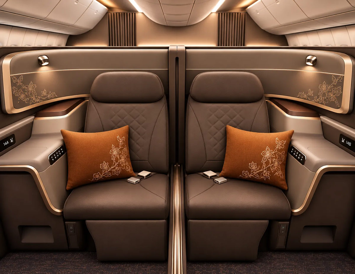
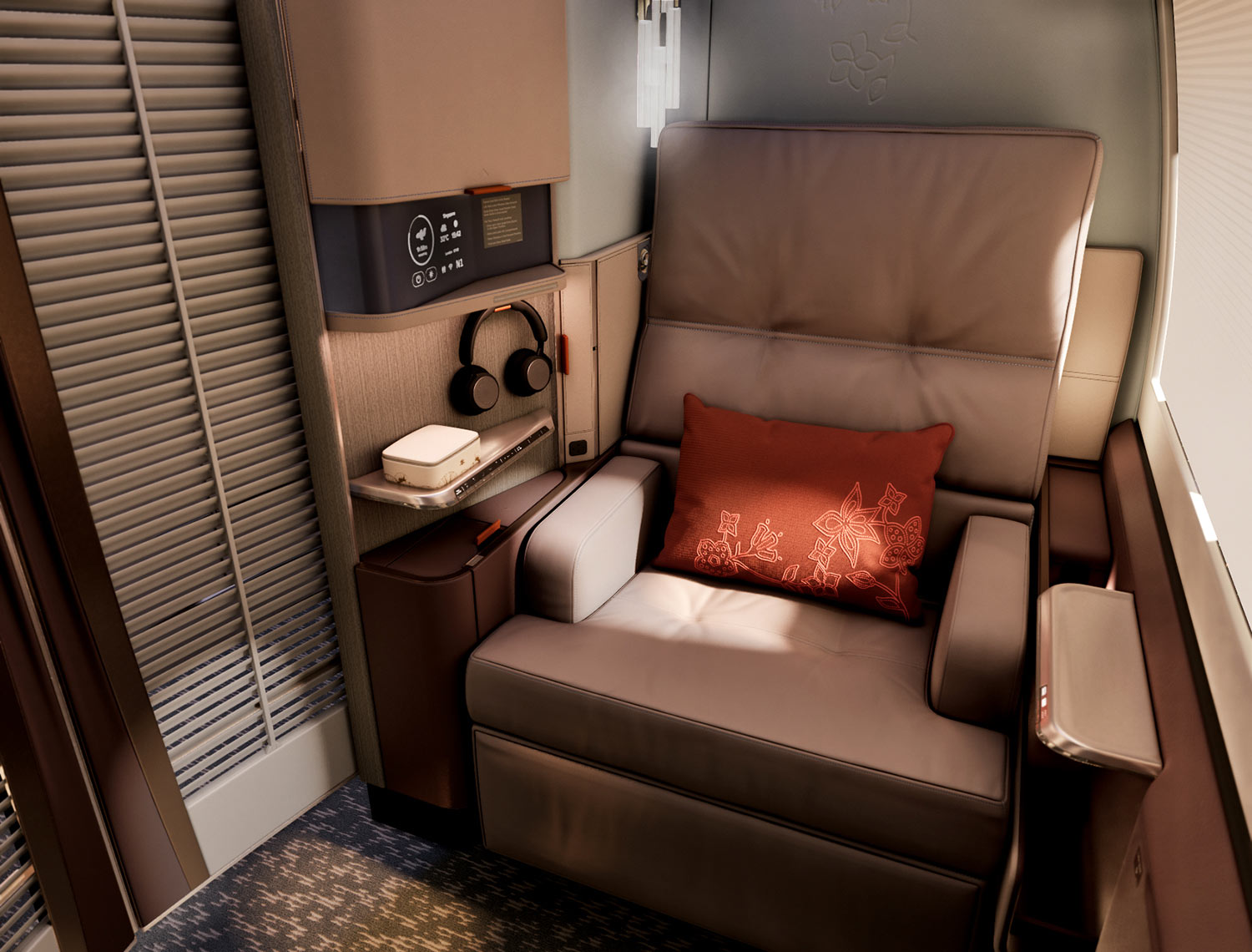
It’s a bold choice, and cabin lighting can change how colours come across in service, but it really doesn’t do much for us. What we can’t quite understand is the gap between this and the new First Class, where PriestmanGoode went with batik-inspired feature walls, soft blues and rich brown leather with touches of terracotta.
(Image: Singapore Airlines)
Whatever you think of it, the new F cabin shouts SIA through and through.
On a 777-9 or a refitted A350 ULR, walking from one cabin into the next may feel like changing airlines.
The frustrating part – it’s actually a good seat
The sad part is that if you strip away the colour debate, this is actually quite a good seat, and a significant step up from the 2013 J it replaces.
The footwell is spacious, and there’s no longer any need to sleep at an angle with your feet tucked into a small cubby hole under the console and off to the side in front of you. David Flynn reported that his EU size 42 feet fitted fine, even with shoes on, while lying on his back, though side sleepers may still need to angle their knees a little.
(Image: Singapore Airlines)
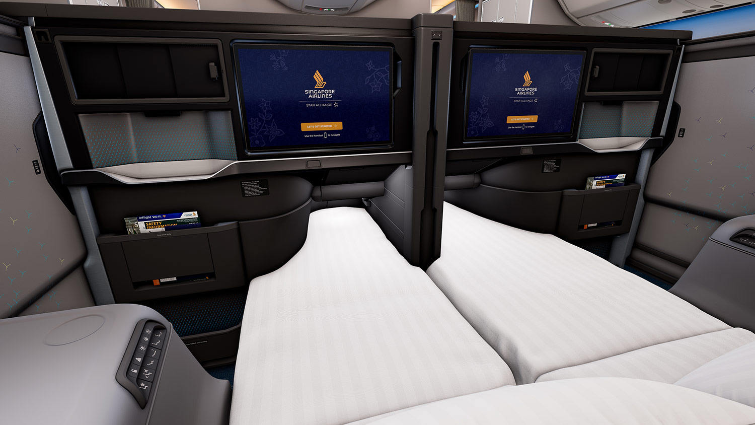
You also no longer need to flip the backrest over to make the bed – it’s all done at the push of a button. The addition of sliding doors, while arguably long overdue, brings welcome privacy, with walls at 52 inches, only an inch lower than Qatar Airways’ much-lauded Qsuite.
Selected centre seats can also become companion beds, at eight rows on the 777-9, and perhaps at six and 10 rows respectively on the A350 LH and A350 ULR, to be confirmed once their seat maps become public.

(Image: Singapore Airlines)
The forward-looking view from the seat remains quite attractive as well.
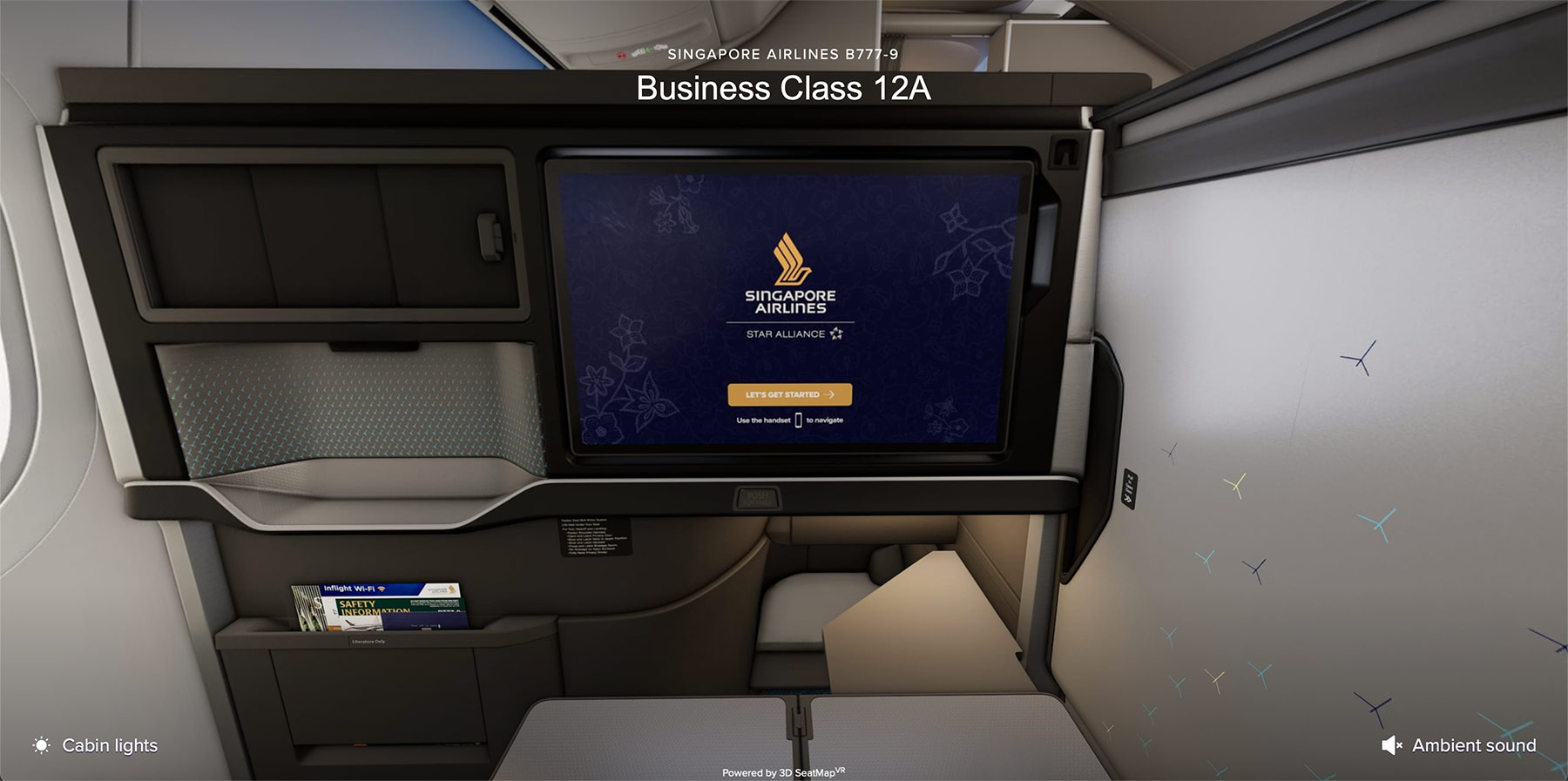
In SIA’s virtual tour of the 777-9, it’s dominated by charcoal, silver and that backlit pattern, with a lighter tone around the footwell and barely a hint of yellow.
(Image: Singapore Airlines)
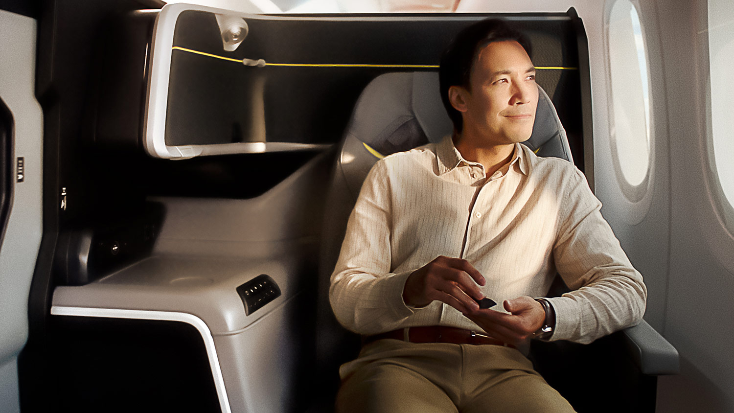
Much of the yellow trim is most visible from the aisle. From the seat itself, where you’ll actually be spending a 13-hour flight, it looks a lot better than some of the marketing shots suggest.
For us, the bigger problem with the new Business Class isn’t the colour, it’s the width.
At 22 inches on the A350s, the new seat comes in well below our expectations, a full six inches narrower than today’s 28-inch 2013 J.
(Photo: Singapore Airlines)
In fact, the 2027 J Business Class on the Airbus A350 will only be three inches wider than the Premium Economy Class seats on the same aircraft.
Qantas is offering a 25-inch-wide seat on its upcoming A350s, in a similar staggered 1-2-1 layout with privacy doors, so we’re surprised SIA won’t come close to that on its own A350s. Even the wider 777-9 version, at 24 inches, falls an inch short.

(Image: Qantas)
Can SIA change it?
Before you get your hopes up about a possible “bang table” campaign, let’s be clear – realistically, the seat itself isn’t changing.
Both the new First and Business Class seats are already certified on the Boeing 777-9, and Executive Traveller’s David Flynn says many of the Business Class seats have already been manufactured.
The colours are potentially a different matter, at least in theory. Leather covers, stitching, trim and accent finishes are the most changeable parts of any cabin (they get replaced every few years anyway), and with the first seats not flying until the second half of 2027, there might still be a window of opportunity there.
That said, re-trimming seats that have already been built isn’t cheap. Airlines have changed course on delayed products before – Emirates scrapped its original 777X Business Class design entirely as the type’s delays mounted – but that was a far bigger decision, and SIA’s seat is already built and certified, at least on the 777-9.
We doubt SIA will change much if anything about the 2027 Business Class now, especially having publicly defended the palette choice before the launch.
But given the strength of the feedback, we wouldn’t be surprised if there are a few discussions over the coming weeks about how to stop this seat becoming known as “Scoot J”, rather than “2027 J”, among frequent flyers. That would probably be unfair on what is otherwise a solid product improvement.
Summary
New Singapore Airlines Business Class products have usually won near-unanimous praise from frequent flyers and the aviation media. This one has everyone agreeing too, just not in the way SIA would have liked. The consensus is that it doesn’t look much like a Singapore Airlines seat.
The irony is that underneath the grey and yellow, it fixes most of what people dislike about the 2013 J. Angled sleeping, the flip-over bed and the lack of privacy doors are all gone, and the cramped foot cubby has been replaced by a proper, spacious footwell.
The narrow 22-inch width on the A350 is a legitimate gripe (the 2006 J was 30-34 inches wide), while the colours are largely a matter of taste – though plenty of people feel this one is at odds with SIA’s brand.
Nobody is likely to switch airlines over a yellow stripe though. Once the doors are closed and the lights are dimmed, most passengers will care far more about the food, the bed and the IFE selection, but first impressions matter, especially after waiting this long, and this one hasn’t gone down as well as the airline might have hoped.
(Cover Photo: Eric Rosen / The Points Guy)
Hey, sorry for being the odd one out lol.
I didn’t realise the Scoot seats were rather similar in colour, having never flown Scoot anything. That is a bit odd to be sure. But I still maintain First is nothing ground breaking either.
All in all, rather a disappointment all round.
Wow this is bad. The design, colours and width. This belongs on TR or perhaps LH. I have always made a point to fly new SQ products when they come out (and then usually a lot thereafter – especially my beloved 2006 vintage seats that are sadly gone now). Will skip this one.